Global reporting is a graphical reporting feature with the ability to display data beyond a single site. The resulting report data from multiple sites becomes very powerful for comparisons and exception detection. There is a comprehensive set of tools to filter and sort the data sets along with export ability to transfer the results into other applications.
There are four key metrics global reporting can display:
- Checklists
- Utilisation
- Impacts
- Concurrent Logins
To Display Global Reporting
- From the menu on the ribbon bar, click REPORTING and then Global Reporting.
- Global Reporting will open
Tools and Summary
Global reporting contains a tools and summary pane. This allows not just the selection of the metrics to display but also the tools to manipulate the data.
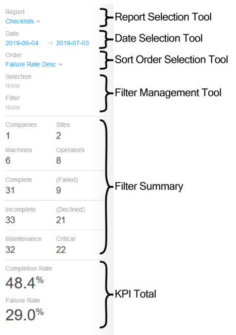 Report Selection Tool
This tool is a drop down list that allows the selection of the key metric report.
Date Selection Tool
This tool allows the selection of the start and end dates of the data. Clicking on a date will display a calendar to allow the selection of the start and finish dates. Selecting a finish date or selecting a region outside of the calendar will complete the selection.
Sort Order Tool
This tool allows the selection of the sort field and the direction of the sort. This can be ascending or descending.
Filter Management Tool
This tool is for the update and removal of the selected filters. See the filters section for more information on applying filters.
Filter Summary
This displays all the totals for the data in the graphs. As the data is filtered, the values are updated.
KPI Total
This displays the totals of the KPI indicators. As the data is filtered, these totals are updated
Global Reporting Charts
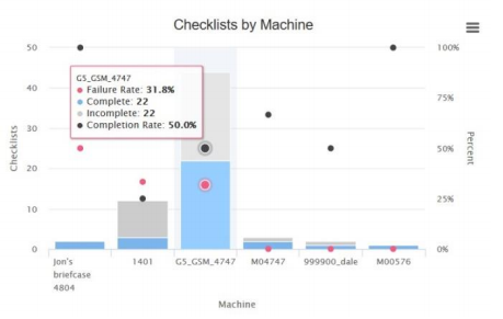
The Global Reporting charts are interactive to allow the selection of data for filtering. Use the scroll bar to view data on graphs with large amounts of information.
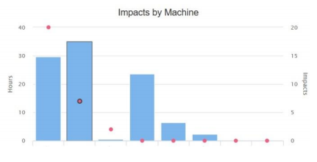
The scale on the left of the graph is for the bar graphs. The scale on the right of the graph is for the KPI indicators.
Mouse Over
By hovering the mouse over a bar, the values of the bar graph are displayed automatically.
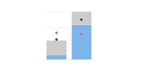
KPI Points
Within each bar chart, up to two KPI points are displayed and are seen as coloured dots. The value is typically calculated as a percentage and provides a direct comparison to other KPI points in the same graph, irrespective of the value within the bar.
Filter Selection
Clicking on a bar within the graph will select that data for filtering. A selected bar will be shown with a black border around the bar and KPI points. Clicking on a selected bar will de-select it, and multiple items can be selected before applying the filter.
Once the selections have been made, use the filter management tool to apply the filter to display only the selected data. Filtering can be performed multiple times to isolate the data of interest.
Export Tools
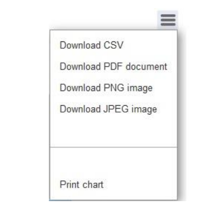
The top right of each graph contains a menu icon which, when selected, allows the export and/or printing of the graph. The export feature includes the CSV file format or the raw data, which can then be used in a spreadsheet application. Also available are graphical formats such as PNG.